Saturday 28 March 2009

Timothy Liles

Design Boom

Forever obsessed with shopping in Paperchase and always buying new pens and pencils when I never really need them I fell in love with these colour rings designed by Timothy Liles. Packaged in sets of 8 these coloured rings are washable crayons... what an unusual way to draw!

Thursday 26 March 2009

Toshiba time sculpture advert

As the visual communication industry is vastly expanding I decided to also look into other areas of design for research. As Graphic design is connected to Multimedia design I researched into some adverts that are currently being shown on television. One of my favourite ones I found is this for Toshiba produced by Grey London. This commercial is an evolution of the ''bullet time'' technique which was first made famous by The Matrix and the campaign was used to promote Toshiba's new range of products.  I think the soundtrack provided by Crystal Castles also fits well into the sequence.


Audi Advert

Car maker Audi continues to make some beautiful commercials for their cars, the latest advert for Audi is entitled 'Unbox the box' created and directed by Aaron Duffy and Russell Brooke. I love the graphics and the animation.
..

Re: Fold 7

After sending another email to David Balko at Fold7 I finally heard back from him today. As I really liked the work that Fold7  produced I would really like to try and get down to London in the holidays and show them my portfolio, as David gave me his telephone number I will definately be getting in touch.

Attached below is the email I received.


Wednesday 25 March 2009

Johnson banks and Fold 7

Today i emailed Johnson Banks and re emailed fold 7 after not hearing back from them.

The emails I sent are attached below.


Email to Johnson Banks


Follow up email to David Balko at Fold7

Tuesday 24 March 2009

Johnson Banks

In a nutshell; Since 1992 the design agency Johnson Banks have demonstrated that it is possible to be strategic and creative about identity and branding. They like to start with words rather than pictures and they work right down to the core to find compelling ideas and simple solutions.

I was attracted to alot of their work featured on their site, and also found their site really easy to work and very informative. One of the most appealing pieces of design for me was that which was produced for 'The art fund' Which is a national art collection fund which has been kept a big secret in the UK for sometime. Their job was to share this secret with a new generation and also help to grow awareness of the fund. A new identity was produced which consists of a heart and the edge of a gallery frame. I really like the use of the two elements and it also reminds me of the identity we produced for a stamp convention in Stockport... combining two elements to make one visually pleasing logo.


Gregoire Alexandre

I came across the work of Gregoire Alexandre whilst looking on the swiss miss blog. A french photographer Alexandre's website contains no words only beautiful images. I was attracted to these photographs because I thought they were different to anything I had ever seen before, beautifully eyecatching and really experimental.


Thursday 19 March 2009

Studio 8

Studio 8 design is an award winning independant Graphic design studio with a reputation for delivering intelligent and engaging creative solutions; Established in 2005 by Matt Willey and Zoe Bather. My favourite piece of design work is the postcard booklet designed for 'Little Yellow Jacket' promoting a hire service. The book is designed to have flexible usage and can be read in sequence like a booklet or individual cards can be torn out like postcards. 


For me, I really like this piece of design because of the different colour spectrum used aswell as the typography. I like how the type reads across each different postcard and the same composition is equal on each page.

Rubitone - the cool 'pantone' rubix cube!

Whilst browsing the web I came across this cool rubix cube designed for Pantone..... i really love the idea behind it. The concept was designed by Ignacio Pilotto, however it is not a commercial product!


Saturday 14 March 2009

Non-Format

Non - Format is a creative team of Norweigan Kjell Ekham and British designer Jon Forss. They work on a range of projects including art direction, design and illustration for arts and culture, fashion and advertising. Their clients include, Nokia, Orange, Tate modern, Coca- cola and the New York times.

I particularly like the poster they designed for the Felt Tip exhibition titled ' I did mediocre stuff while you were still in school' i really like how detailed the typeface is, its a beautiful design.

Thursday 5 March 2009

Dinosaur design agency

Dinosaur design is an agency founded in 1999 in Manchester. There expertise embraces advertising, branding, re-branding, events and planning for a diverse range of clients. Some of their clients include; Manchester united, Urbis, Selfridges, Alton towers and Wagamama.

I particularly liked there motto...well little poem '' So why not take the sound advice of was no was; open the door, get on the floor, everybody walk the dinosaur''

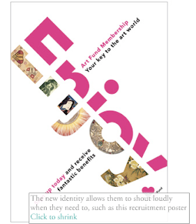
I really like these poster advertisements for Urbis:


I really like how effective these pieces are, just by using lots of images to create a whole new image.


Wednesday 4 March 2009

A to M

A to M is a design agency formed in 2003 in Manchester, they offer a wide variety of services and skills from original illustration to identity projects. They love working with small ambitious independant arts and music companies as well as established brand names like Topman and Nike.

Some of their clients include, Piccadilly records, Topman, DXN magazine, maD and night and day. Although some of the clients i had never heard of i really liked the work that they had produced.


I particularly like this work for Mad on tour promotion. A to M were asked to produce publicity and a logo for a play about a band who hijack a bus in Amsterdam to play a gig. The bus ticket was used for each venue. I really like these designs as its turning something found in the environment into something really interesting that works well. They also remind me of the work that design agency Glorious produced for the Liverpool and Manchester design initative when they produced a parking ticket as an invitation.