Friday 8 May 2009

Fluid Design

I regularly revert to the Form fifty five forum to look at design work and it regularly features some work from really nice design agencies. One in particular I came across was the work of Fluid design. A company established for 14 years with 82 brands and 205 campaigns. The company was launced in 1995 by director James Glover and their work ethos is 'Never not creating'...

Now onto their work..

I really liked the project for the client 'The Hyatt company' the menu they produced is really nice and sleek with nice typography embossed onto the card with only the slightest colour used which works really well. The invitation they also produced works well and is aesthetically pleasing with particular attention being payed to the typography. It's the typography that I am particularly drawn into by.


www.fluiddesign.co.uk

Thursday 7 May 2009

A to M Reply

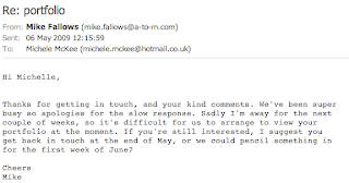
Maybe I should check my emails more regularly as yesterday Mike Fallows from A to M emailed me back. He apologised for not not replying back sooner as he as been super busy and that he is away for the next few weeks so at the moment it is difficult for us to arrange a portfolio visit. However if  I am still interested he could see me at the beginning of June I should just get in touch with him nearer the time.

Email recieved from Mike :


Top Corner

After coming home from my folio visit today I opened up my emails and had already recieved an email from Barry saying that it was nice to meet me today and if I could send a pdf version of my folio over to him so he can show his work colleagues. I thought this was excellent as now I can get more input on my work from other designers.

Email from Barry:


Top Corner - Folio visit

Today I went to Top Corner's studio in Manchester to meet Barry McManus and get some feedback on my portfolio.

My initial reaction to going along to the studio was as to be expected.. quite nervous! It's quite a daunting experience going showing your work to someone who quite frankly has more knowledge than yourself and could slate your work but it was something that had to be done.

I'll be honest, I don't think my portfolio was quite up to scratch. It was quite thin looking and probably didn't have enough work in but all the same I went to see Barry to get some much needed critiscism.

Top Corner is based near Manchester University and after a while of walking around and getting caught up in crowds of other students I eventually found the building. I was quite amazed as the building alone was quite interesting. Set near the train station it was clear that the building may of been part of the rail way at some time as large beams and metal structures helped to hold the building up.

I met Barry upon arriving and he took me into a very large board room filled with lots of work, by now my nerves had gone and I started to feel slightly more relaxed. I began by talking through my portfolio and explaining briefly what my ideas were for each piece. Barry then spoke about what he liked and what could be a developed further. Barry said that he was surprised by the work I had shown him as normally he recieves PDF's from students and is not normally overwhelmed by them. He particularly liked my typeface 'Play thing' I had developed in the typography elective and he especially liked the editorial spreads I produced for  the British Dental Museum.

We spoke for a while about College as Barry said he has heard really good things about the degree. I told him about the Thoughtful six placement and also the 3rd years hiring out a big red bus to drive around town showing their portfolios on. He thought these were very exciting ideas and ones he never recieved as after college he got a job straight away.

Barry gave me some really useful hints and advice such as; maybe making my portfolio slightly bigger - maybe even square, try adding more content to it as at the moment there isn't a lot of work, try adding some of my scamp or sketched idea's into it otherwise other people looking at my portfolio may think it only took me a few hours to produce some of the work when in fact it took weeks. Barry also said that my Saatchi Gallery end-sting didn't really make sense as a storyboard and maybe it would be better to see it actually moving on flash.

We spoke about placements and Barry said that their studio wasn't really big enough to have someone else coming into work as they had no desk space. However, he did say that in a couple of weeks when they recieve a brief that he will send the brief over to me so I can have a look at it and come up with some ideas and for me to then send them over to him. He also said anytime I need some work critiquing he will be more than happy to have a look.

In all I came away from the studio feeling quite suprised that someone liked my work and suddenly found a new confidence that I should be happy with the work I produce but that also maybe I should try slightly harder and push myself a bit more. I want to get better and I will follow his advice and push my portfolio forwards.

Tuesday 5 May 2009

One day brief - Species and Spaces

On the first day back of easter we recieved a brief called 'Species and Spaces' that was to be completed that day. We were asked to go to an environment, mine being Starbucks and record through writing the everyday happenings of that environment. I really thought the brief sounded exciting as it challenged our minds and imaginations into doing something we hadn't done before. However, when getting to my destination I found it difficult to know what to write, although it wasn't rocket science! Below is my finished piece of writing: 


It’s almost twelve o’ clock and im sat on a big comfy chair drinking a venti caramel machiatto and watching the world go by. Cinnamon and vanilla, the aromas of coffee is so strong. Table could do with a clean and there is food all over the floor, bits of cracked chocolate. Too much to choose from ‘ Tall, grande or venti’. Does coffee have lots of calories in? People in a hurry,
people going slowly. It’s such a lovely day why would you want to sit inside and drink hot drinks? Music is mellow and not in English, why would it not be in english?Time passes by so slowly. A lady sits quietly doing a crossword in a newspaper,
everything is so peaceful and relaxed. Who thinks of all the different coffees to make? ‘ I took the wrong coffee’.  It’s now 12:15 why has nobody come to clean up the plates from the table? Green and black. Mugs are really big maybe bigger than my head. Why do people come to starbucks on their own to read and drink, why not just do that at home? Coffee grinding mugs banging. Ouch that is hot. Not many people want to get their coffee fix today as it’s not very busy. Everyones enjoying the weather, people passing by in t-shirts and shorts with shopping bags. Starting to feel really sleepy. The door is open and a slight breeze is flowing through. What is the starbucks logo supposed to represent? The woman has no arms? Empty packets of sugar are now outlining the table. Theres a strange couple sat near me playing on their phone, do they not have anything better to do. Fairtrade coffee... surely coffee is just coffee? A little kid is shouting, i don’t think it’s a place you would bring a child too. What would a child drink in a coffee shop? There are lots of lights especially ones that hang quite low, it’s quite a modern coffee shop. Lots of unusual art on the walls, I wonder who designs them. ‘ I really need a napkin my drinks leaked everywhere’ Why do they fill the drinks so high? It’s lunch time now, surely there should be a queue of people by now? The tables have now finally be cleaned, not very well though. A spoon would be handy right now to scoop the cream off the top of the hot chocolate. The newsagents over the road is very busy, what could people possibly be buying? Drinks, ice lollies maybe even cigarettes? The sound of the coffee
machine is much louder than the music now. What you having to drink?’ Whos next please’. How many coffee beans actually make a coffee? You can actually buy coffee beans and mugs to take home. I wonder if Starbucks is as big over here as it is in America? Mugs and a tray clatter to the floor. A big piece of choclate cake has been left half eaten on a plate, how could you waste that? It looks so nice, far too many cakes to choose from. ‘ Flavors my senses sweetens my disposition stirs my
imagination nourishes my dreams’ They sell tea aswell so why call it Starbucks coffee? They have additional seating upstairs, I wonder if it’s busy up their. Coffee of the week, cinnamon coffee. Doesn’t sound nice. There’s a mark on the ceiling bits are hanging off...is the ceiling caving in? What does starbucks actually mean? I wonder if Starbucks is busier than Costa coffee or Nero. Im not much of a coffee lover myself.

Sunday 3 May 2009

Sort Design

'Enhancing businesses through effective design' ... Sort design is a Belfast design and branding studio founded in 2006. I came across them after finding a new blog called Grafikcache.com and their work was featured on that.

I was particularly drawn to the work they had produced for St patricks festival in Dublin. For the last 3 years Sort design have worked with the client to create branding, advertisements and promotional materials. I like this work for its typography and it's strong use in colour. This particular colour theme represents the variety of activities which take place at the festival which I think works nicely.


A - side studio

Based in Falmouth A-side studios do Id's, tees, books and magazines. 

Their branding and promotional campaign 'Mark' is the work I recently saw on grafikcache. Mark is a new furniture and lifestyle brand based in Cornwall and the promotional materials they produced for the company reflect values of a contemporary Cornwall.


They also do some really nice business cards for numerous companies!

Seven25

Isabelle Swiderski is the creative director of seven 25, founded in 2000 in Vancouver. They are a multidisciplinary creative direction and design agency discovered on the Form fifty five forum. The understand that powerful ideas and images inform or inspire.

I really like the work they produced for the 'LOUD' foundation in which they named the foundation, designed it's identity and all materials for the campaign. 


I really like the logo above as in between the words the exclamation mark can be seen, it's a really interesting piece of design.


Mark Studio

After browsing through Form Fifty Five's blog I saw a feature on Mark studio, apparently Mark studio who Dan Ingham works for has recently updated their website therefore I decided to have a further look.

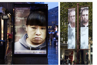
I particularly liked the work they produced for the comedy store. I think it's interesting how they challenged the idea of comedy by turning it around and using images of people being well miserable to promote the store. The photography is very strong and compositionally I think it is aesthetically pleasing.


I also really liked the work they produced for the Manchester Literature festival, a brief that we worked on to some levels in the 1st year. Mark studio state how they solved the brief by saying ' our big idea for the identity came to us while staring vacantly at our book case' I also really like how they show there work in situe so we can see how it works in the envionment.


Saturday 2 May 2009

Telegramme and A to M

After not hearing back from Telegramme or A to M I decided to re - email them... however knowing how busy they must be I know a reply may be doubtful.

Friday 1 May 2009

Graphical House

Graphical House is an agency based in Glasgow who specialise in print, motion graphics, animation, typography and identities to name but a few. I first came across their website when I saw a piece of their artwork on the Form fifty five blog and decided to look into them as a company a bit more. As an agency they state about the work they produce ' at any given time we will be working on an eclectic mix of projects: we consider this diversity vital to maintaing our fresh and optimistic approach' and they are also inspired by the culture around us.

I really like the layout of their website and how the work shown has been photographed which gives me great considerationg and inspiration when designing my portfolio. As to the work they produce I like it all! I don't have a favourite piece but I like this A5 brochure which details some of their favourite projects over the past year. I think the typography is very strong and accentuates the rest of the book.


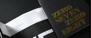
Seven Zero

I came across the work of Gary Austin on the Form fifty five blog. His website seven zero is a portfolio of all his work, what is interesting is that he is a 3year university student. Therefore, it was interesting to see what sort of competition we are up against even though were a year behind.


Austin's work shown the the Form fifty five blog was a piece of work based on a scrabble championship, it was these designs which attracted me into looking into his website. The idea behind it is clever and well executed as he produced a set of interactive beer mats and posters to promote the World Scrabble Championship. The beer mats are perforated so each printed Scrabble piece can be ripped off individually and played with.


His website also features some work he produced for the D&AD competition briefs which I think look really nice. While I myself did not work on this brief when given to us I know some other students did and it's nice to see how a student at a different university tackled this brief.


All in all I really liked all the work shown which only leads us to the conclusion that it really is going to be tough when we all graduate to find a job!

Fake id


Fake Id was founded in 1999 and is an independant graphic design practice that develops projects for exhibitions, performances and workshops etc. Currently in it's tenth year they have produced a range of work such as books and magazines and commisioned different work for clients such as Emigre, Nike, Sony and Urban outfitters.


We were lucky enough to have Yvan Martinez and Joshua Trees who make up Fake Id to come into college and do a workshop with us 2nd year students. The project involved us making sound and dialogue from our imagination and thoughts on an image. I found this a really fun process and it was something we have never done before. As graphic design is changing each day and becoming vastly popular it is becoming more apparent to us that it's not about just sitting down and drawing pretty pictures or making posters or books. Graphic design now covers such a huge area that it was fun to try something new.

When Yvan and Joshua came into college the workshop that they gave us was based on "the voice over''. We were divided into pairs and given an image to work with. We had to use our imaginations to describe what was happening in the image without describing anything we could see. Challenging I know.  The brief was really interesting and something we hadn't done before, it challenged us to open our imaginations and work outside of what we know nomally. I really enjoyed it.Myself and Kat were given an image of a countryside with a sign placed in it saying 'hell is real'. Thinking of an idea was hard at first but we decided in the end to script a 2 minute voice over of a helicopter news report covering a crash on the country road. This is how it went :

"Thanks everyone there in the studio

From what I can see from up here there is what seems to be a rather large shipping lorry that has overturned and is now in the middle of the road and this seems to be the main course of the hold up on the A623…

We have just heard from witnesses on the ground that have said that a Nissan car was weaving in and out of traffic, causing cars and the lorry to steer out of the way …and from what I can see the chaos created is ...there is just wreckage and an outstanding quantityof cars either overturned or mounted on top of each other, prayers with the families of those involved with the collision..

Reports are coming in that the lorry itself was travelling at great speed which caused it to overturn that caused the consequences of the crash, the crash itself has caused major delays and a back log of cars for what I can see from here…stretches miles back

As this is the main Highway leading into the next state there have been reports that several of the cars in the backlog havelooked for their own diversions, possibly in order to get away from the hold up, but please if you are listening to this report then we advise you to stay in your vehicles and STAY WHERE YOU ARE. If you know of friends and family that may be involved in the crash then ring 0800 900 300 and we will give you news as it comes to us

Emergency services are on their way to remove the lorry and let the traffic continue by.

Breaking news! We are hearing of people running away from what looks like a tank exploding in the middle of the chaos area, we do not know how this started we ….we remind you if you are not involved in the main crash site to stay where you are, do NOT take diversions just yet we do not know whether you will be safe

This really Is a quite horrific crash and we will keep you updated with the news as it comes, back to you in the studio…"