


An idea on the page is worth 100x more than an idea in the mind. You can only judge and be judged by work that’s executed. Eventually, we all realize that most of the ideas that look great in our mind look dumb once they’re real. But, at least you now know.'


What made you initially passionate about design?
What designers influence you in your own work?
What design book do you often look at, or is your favourite?
just me with 1-2 interns or design assistants at timesHow many designers work at your agency?
YES! Many many talented graduates lacking in experience...Also. Living in England it is extremely hard to get a job in the design industry as there are a lot of students graduating from University who all want the same job. Is this the same in America?
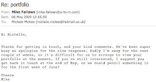
Thank you for your time. I look forward to hearing from you,Michele McKee


On the first day back of easter we recieved a brief called 'Species and Spaces' that was to be completed that day. We were asked to go to an environment, mine being Starbucks and record through writing the everyday happenings of that environment. I really thought the brief sounded exciting as it challenged our minds and imaginations into doing something we hadn't done before. However, when getting to my destination I found it difficult to know what to write, although it wasn't rocket science! Below is my finished piece of writing:
It’s almost twelve o’ clock and im sat on a big comfy chair drinking a venti caramel machiatto and watching the world go by. Cinnamon and vanilla, the aromas of coffee is so strong. Table could do with a clean and there is food all over the floor, bits of cracked chocolate. Too much to choose from ‘ Tall, grande or venti’. Does coffee have lots of calories in? People in a hurry,
people going slowly. It’s such a lovely day why would you want to sit inside and drink hot drinks? Music is mellow and not in English, why would it not be in english?Time passes by so slowly. A lady sits quietly doing a crossword in a newspaper,
everything is so peaceful and relaxed. Who thinks of all the different coffees to make? ‘ I took the wrong coffee’. It’s now 12:15 why has nobody come to clean up the plates from the table? Green and black. Mugs are really big maybe bigger than my head. Why do people come to starbucks on their own to read and drink, why not just do that at home? Coffee grinding mugs banging. Ouch that is hot. Not many people want to get their coffee fix today as it’s not very busy. Everyones enjoying the weather, people passing by in t-shirts and shorts with shopping bags. Starting to feel really sleepy. The door is open and a slight breeze is flowing through. What is the starbucks logo supposed to represent? The woman has no arms? Empty packets of sugar are now outlining the table. Theres a strange couple sat near me playing on their phone, do they not have anything better to do. Fairtrade coffee... surely coffee is just coffee? A little kid is shouting, i don’t think it’s a place you would bring a child too. What would a child drink in a coffee shop? There are lots of lights especially ones that hang quite low, it’s quite a modern coffee shop. Lots of unusual art on the walls, I wonder who designs them. ‘ I really need a napkin my drinks leaked everywhere’ Why do they fill the drinks so high? It’s lunch time now, surely there should be a queue of people by now? The tables have now finally be cleaned, not very well though. A spoon would be handy right now to scoop the cream off the top of the hot chocolate. The newsagents over the road is very busy, what could people possibly be buying? Drinks, ice lollies maybe even cigarettes? The sound of the coffee
machine is much louder than the music now. What you having to drink?’ Whos next please’. How many coffee beans actually make a coffee? You can actually buy coffee beans and mugs to take home. I wonder if Starbucks is as big over here as it is in America? Mugs and a tray clatter to the floor. A big piece of choclate cake has been left half eaten on a plate, how could you waste that? It looks so nice, far too many cakes to choose from. ‘ Flavors my senses sweetens my disposition stirs my
imagination nourishes my dreams’ They sell tea aswell so why call it Starbucks coffee? They have additional seating upstairs, I wonder if it’s busy up their. Coffee of the week, cinnamon coffee. Doesn’t sound nice. There’s a mark on the ceiling bits are hanging off...is the ceiling caving in? What does starbucks actually mean? I wonder if Starbucks is busier than Costa coffee or Nero. Im not much of a coffee lover myself.